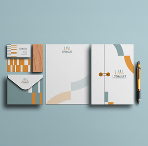


A visual identity for LOGIT, a company specializing in logistics real estate, created as part of my work as a digital designer at Sabio advertising agency.
The project translates the brand’s intelligence, flexibility and precision into a distinctive visual language.
The identity is built around modularity - simple geometric shapes that come together in different combinations, reflecting the adaptability and connectivity at the heart of logistics.
I designed a geometric logo and a cohesive visual system, pairing vibrant blue with deep navy and white. The logo’s shapes extend into graphic elements and patterns, creating a recognizable identity across different scales and formats.
From signage and building façades to stationery and digital applications, the visual language brings consistency and character to every brand touchpoint. The result is a bold, contemporary identity that gives LOGIT a strong presence both in print and on screen, as well as within the physical spaces it develops
BRANDING, PLANNING

Visual Research

Colors

Logo Design Process


Logo Integration in the Physical Space

Building Cladding Inspiration

Building Cladding Visualization

Wayfinding Signpost

Flag

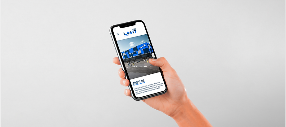
Company Website – Mobile View
Visitor Badge

Office Branding
Construction Site Hoarding

Office Stationery

Office Stationery

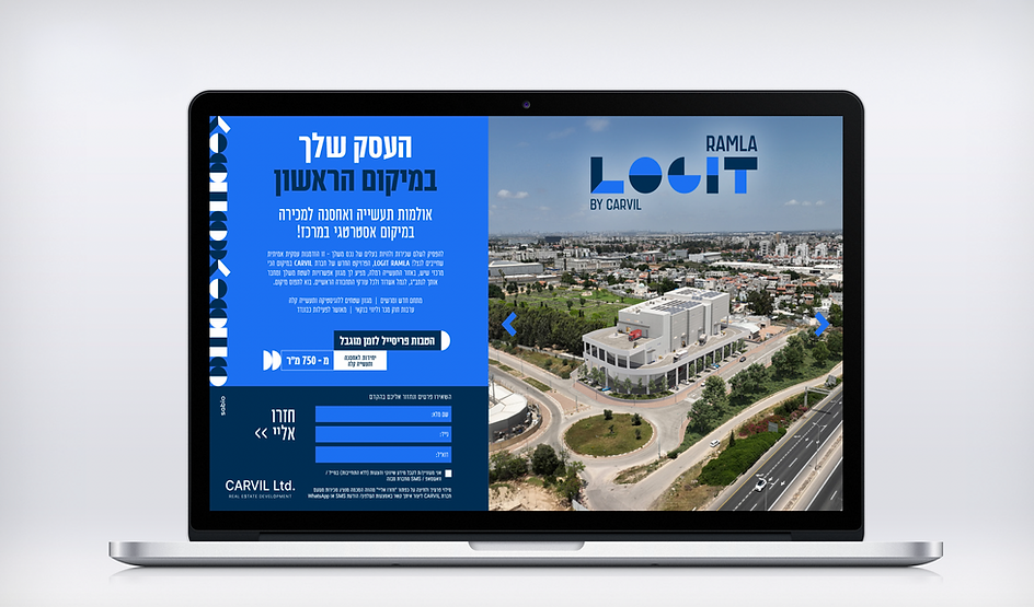
Print & Outdoor Advertising


Icons

.png)
.png)